Every Volume² on-screen display skin is a folder of PNG images and one Skin.xml file. There's no special editor: you draw the pictures in any image editor, describe where they go in the XML, and restart Volume². This guide builds a real skin, Signal, the one in the screenshot below, and explains every part along the way.

Before you start
- Skins only apply to the Skin style. In Settings → OSD, set Style to Skin. (The other two styles, Text and TrackBar, are drawn by Volume² itself.)
- Skins live in the Osd Skins folder inside the Volume² program folder. Each skin is one subfolder, and the folder name is the skin name you see in the list.
- Volume² reads skins when it starts. After every change to a skin, restart Volume², or nothing will seem to happen. This catches almost everyone once.
- The easiest start is to copy an existing skin folder, rename it, and change it. All the skins that ship with Volume² are in the OSD Skins folder on GitHub, including Signal.
What's in a skin folder
Three files are required. Everything else is optional and is used when it's present and enabled in Skin.xml.
| File | What it is |
|---|---|
Back.png | Required. The background. Its size is the size of the whole indicator, and all positions are measured from its top-left corner. |
Preview.png | Required. The thumbnail in the skin list. Keep it small: the original skin guide suggests about 94×54 pixels at most. |
Skin.xml | Required. Where everything goes and how it behaves. |
Meter.png | Shows the volume level: a bar that fills, a set of frames, or a slider that moves. |
Meter_Effect.png | A second level graphic that works the same way as the meter, such as an icon that changes with the volume. |
Mute.png, Meter_Mute.png, Mute_Effect.png | Versions of the background, meter and effect used while the sound is muted. |
Digital_Meter.png | The digits 0 to 9, for drawing the level as a number from images instead of a font. |
Glass.png, Glow.png | Overlays drawn on top of everything else, for reflections and highlights. |
Animation.png | Frames that loop for as long as the indicator is on screen. |
Bright.png, USB.png, Eject.png, Battery.png | Backgrounds for brightness changes, USB connect and disconnect, an opened disc tray and battery level. |
Three ways to draw the level
The Orientation attribute on the meter decides how the picture turns into a volume level, and Max means something different in each case.
| Orientation | How it works | What Max is |
|---|---|---|
Horizontal, Vertical | One image of a full bar. Volume² shows as much of it as the volume. Best for simple bars. | The number of pieces the bar is cut into, minus one. The original guide suggests 100; Signal uses 200 for its 200-pixel bar. |
BitStripRight, BitStripBottom | A strip of frames, side by side or stacked. Volume² shows the frame that matches the volume. Works for dials, rings, anything. | The number of frames minus one. |
BitMoveRight, BitMoveUp | One small image, such as a knob, that slides as the volume changes. | How many pixels it travels from 0 to 100%. |
For frame strips, 101 frames (0 to 100) gives a picture for every percent, but a handful of frames is fine for an icon. The original skin guide also recommends even numbers for image and frame sizes.
Building Signal step by step
Signal is a dark panel with a speaker icon, the device name, the level in green and a thin bar underneath.
1. The background: Back.png
The images in this section are shown at twice their real size.
A 240×84 dark rounded rectangle. Its size sets the size of the indicator, and every position below is measured from its top-left corner (X to the right, Y down).

2. The bar: Meter.png
A 200×6 green bar, the full bar at 100%. With Orientation="HORIZONTAL" and Max="200", Volume² reveals it one pixel per step, from the left.

<Meter X="20" Y="56" Orientation="HORIZONTAL" Min="0" Max="200"
       HideOnMute="false" Colorize="false"/>
A darker track behind the bar is simply painted into Back.png at the same position, so the empty part of the bar still shows.
3. The speaker icon: Meter_Effect.png
Four 24×24 speaker icons stacked vertically (24×96 in total), from quiet to loud. BitStripBottom with Max="3" (four frames minus one) makes Volume² pick the icon that matches the level.

<MeterEffect Enable="true" Orientation="BitStripBottom" Min="0" Max="3"
             LayerIndex="0" HideOnMute="true" X="20" Y="15"
             Colorize="false" FileName=""/>
<MeterMuteEffect Enable="true" LayerIndex="0" X="20" Y="15" Colorize="false"/>
HideOnMute="true" hides these icons while muted, and MeterMuteEffect draws Mute_Effect.png (a grey speaker with a cross) in the same place instead.
4. The text: device name and level
Text is drawn with a font, so it needs no images. A skin can have more than one <Text> element; Signal has two:
<Text Enable="true" X="50" Y="28" MaxWidth="150" Format="%D" FormatMute="%D"
      Alignment="0" HideOnMute="false" LayerIndex="-1">
  <Font Size="16" Color="#FFE8EDF4" ColorMute="#FF7C8896" Name="Segoe UI"
        Bold="false" Italic="false"/>
</Text>
<Text Enable="true" X="223" Y="25" Format="%V%" FormatMute="%V%"
      Alignment="2" HideOnMute="false" LayerIndex="-1">
  <Font Size="20" Color="#FF3FD3A2" ColorMute="#FF7C8896" Name="Segoe UI"
        Bold="true" Italic="false"/>
</Text>- The first line is the device name (
%D), left-aligned, cut off at 150 pixels so long names don't run into the level. - The second is the level (
%V, followed by a percent sign), right-aligned so its right edge stays at X = 223 whether it shows 5% or 100%. Alignmentis 0 for left, 1 for centre, 2 for right, and X is the left, centre or right point accordingly.Formatis used normally andFormatMutewhile muted. Colours are#AARRGGBB: the first pair is opacity,FFfor solid.
These codes can go in Format:
%V | Volume | %D | Device |
%DF | Device (sound card) | %dB | Decibels |
%A | Absolute volume | %S | Status on/off |
%ChN | Active channel number | %NL | New line |
%C(x,y) | Move the text that follows to position x, y | ||
5. The thumbnail: Preview.png
A small picture of the finished skin, shown in the skin list in settings.
6. The rest of Skin.xml
Around those pieces, the file has a header and a few general settings:
<?xml version="1.0" encoding="utf-8"?>
<XMLskinSettings>
  <Info>
    <Author>Alexandr Irza</Author>
    <WebSite>https://irzyxa.blogspot.com/</WebSite>
    <SkinVersion>3.0</SkinVersion>
  </Info>
  <OSD>
    <FadeSteps>18</FadeSteps>
    <ShowSteps>36</ShowSteps>
    <Colorization>false</Colorization>
    <ColorizationColor>-1</ColorizationColor>
    <Background Colorize="false"/>
    <!-- Meter, MeterEffect and Text from the steps above -->
    <PeakMeter Enable="false" ... />
  </OSD>
  <Layers/>
</XMLskinSettings>ShowStepsandFadeStepsset how fast the indicator fades in and out (0 to 255; higher is faster).Colorizationset totrue, withColorize="true"on the parts you choose, tints them with the Windows accent colour instead of your own.ColorizationColorof-1means "use the system colour"; an#AARRGGBBvalue sets a fixed one. Windows 11 v3 Dark uses this to match your accent colour.PeakMetercan draw a live level meter of the sound that's playing on the indicator, withMeter_All.png(mono) orMeter_Left.pngandMeter_Right.png(stereo).
The fastest way to get every element with sensible defaults is to copy Skin.xml from an existing skin. The original skin guide also describes a shortcut: create an empty skin folder, open Skin Settings for it and press Apply, and Volume² writes a Skin.xml with every parameter for you to fill in. The full Signal file is on GitHub.
Layer order
Parts are drawn in a fixed order: background, animation, meter, text, digits, glass, glow. For the effect graphic and the peak meter you choose where they go with LayerIndex:
-1what the shipped skins use for text0after the background (under everything else)1after the animation2after the meter3after the text4after the digits5after the glass
Test it
- Put the skin folder in Osd Skins.
- Restart Volume².
- Open Settings → OSD, set Style to Skin and choose your skin.
- Change the volume, then mute and unmute, to see both states.
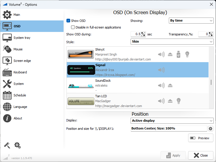
If something is in the wrong place, adjust the X and Y numbers, restart and look again. A few rounds is normal.
Tips
- Paint the static parts into Back.png. Anything that doesn't change with the volume (a border, an empty track, a label) belongs in the background, not in a separate layer.
- Transparency works. PNG transparency is kept, so rounded corners and shadows on
Back.pngshow over the desktop. - Older skins look different. Skins made before the current format use separate elements such as
<MeterOrientation>instead of attributes. They still load, and the original skin guide (in Russian) describes that format and the tray and peak-meter skins.
Share it
Made something you like? Post it in the comments below or open an issue on GitHub with the skin folder attached. Good skins can join the collection that ships with Volume², with your name in the Author field.